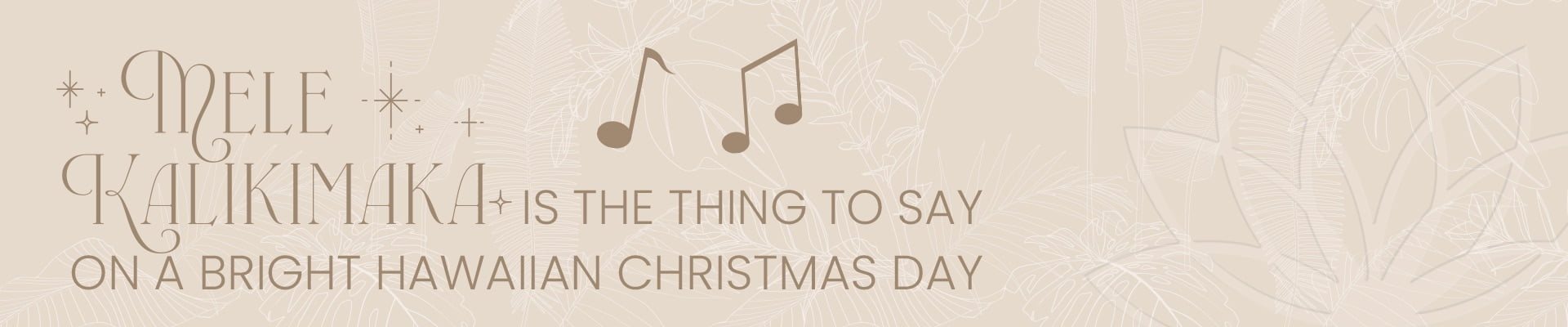


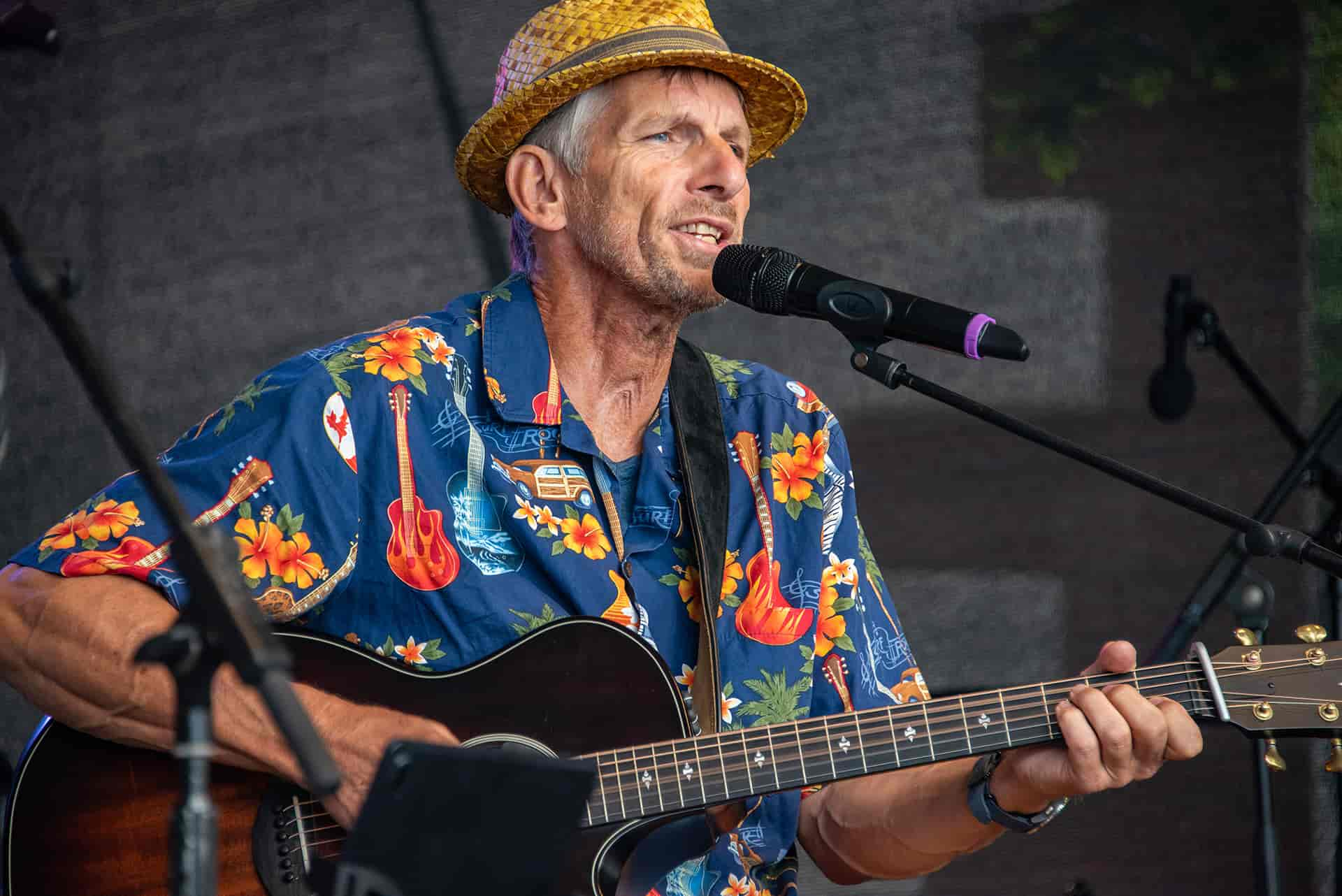
‘Mele Kalikimaka!’ – Christmas greetings from Hawaii!
A festive surprise, prepared and served à la Brainartist.
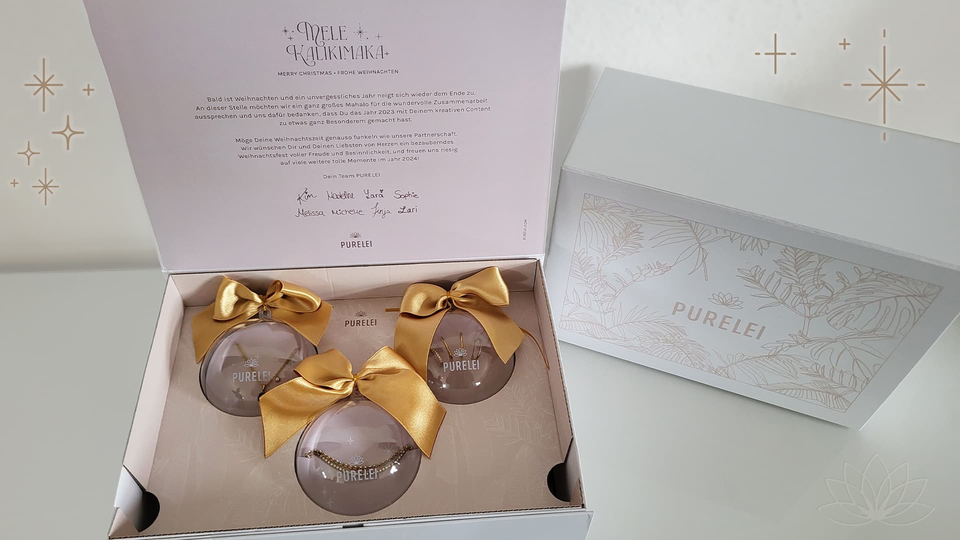
Like every year, Christmas came as a surprise again last year, but this time with a particularly delightful surprise. Melissa from PURELEI knocked on our little door, asking if we could envision sending a selection of their jewellery and lifestyle products inspired by Hawaii, to over 70 influencers for Christmas. The gift box was meant to be a special ‘Mahalo’ for their great collaboration, appealing, high-quality, and suitable for shipping. So, we swiftly pondered whether and how we could execute the project in pre-Christmas rush, considering we had just under 6 weeks from inquiry to conception, production, and shipping.
So we quickly tossed our ideas into the pot, stirred well, seasoned briefly, and voilà! We had a recipe that pleased everyone. Once all the ordered ingredients arrived, our elves rolled up their sleeves and got to work at a breathtaking speed.
We settled on printed and ribbon-adorned Christmas baubles with handmade inlays for securing the respective jewellery pieces, presented in a premium magnet box with a dedication on the lid. The baubles were protected from turbulence during their wild sleigh ride with the help of two cardboard inlays inside the box. Not only did this save weight, but it was also more sustainable than foam inserts.
Speaking of sustainability – thanks to incorporated ribbon loops, the Christmas baubles could adorn the tree directly, yet also offered the opportunity to decorate them according to personal taste and reuse them. Thus, we brought smiles to the faces of influencers even in distant Dubai.
We’re delighted with the positive feedback and say ‘mahalo’ for this joyful project.


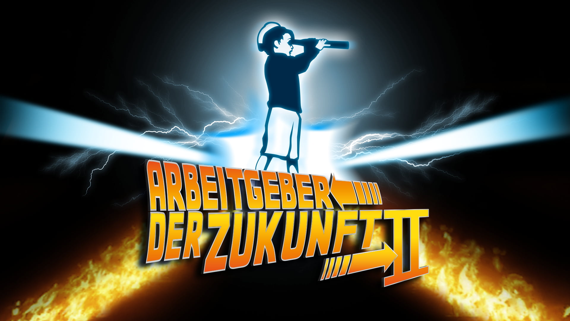
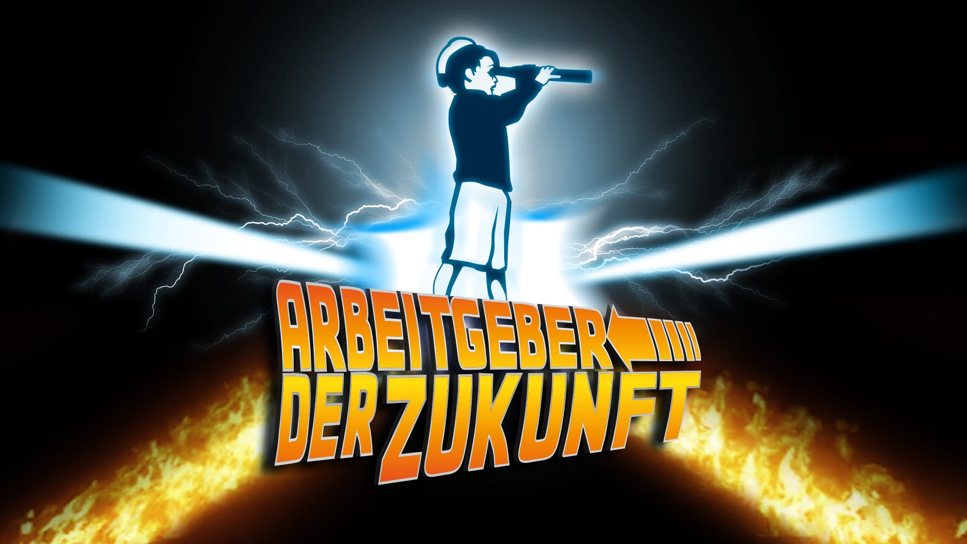
We are employers of the future! Part II
After the success of the first part, we were awarded again in 2023.
‘There it is, our next award’. Fans of our award series know that this sentence started our post of the now first part of the ‘Employer of the Future’.
Missed part one? View it here!
We are and have always been future-oriented. That’s what our curious little boy stands for, always keeping an eye on the horizon to identify new trends, sustainable production techniques and innovative advertising opportunities at an early stage.
As of today, we can once again call ourselves ‘Employers of the Future’. Awarded by the German Innovation Institute for Sustainability and Digitalisation and the German Entrepreneur Platform and under the patronage of Brigitte Zypries, former Federal Minister of Economics—a short fanfare at this point—we are proud that our efforts for more digitalisation, innovation and sustainability have also been noticed in our agency again and found worthy of being honoured.
So we continue to look to the future, knowing that we are ideally equipped for it. Off we go to new goals; possibly to a third part?
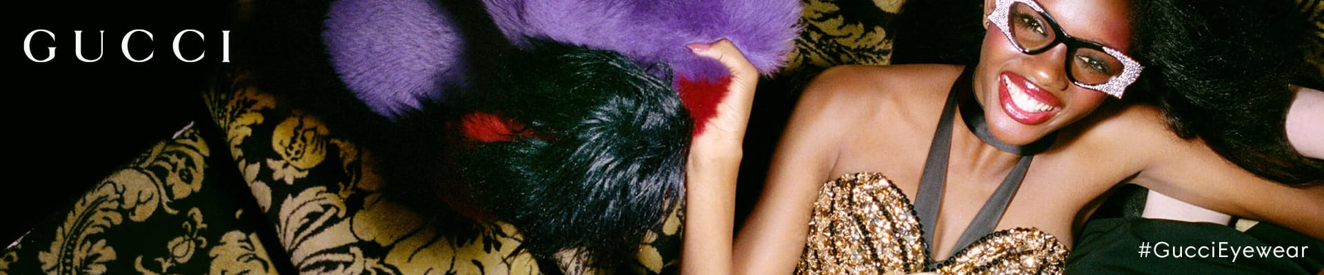
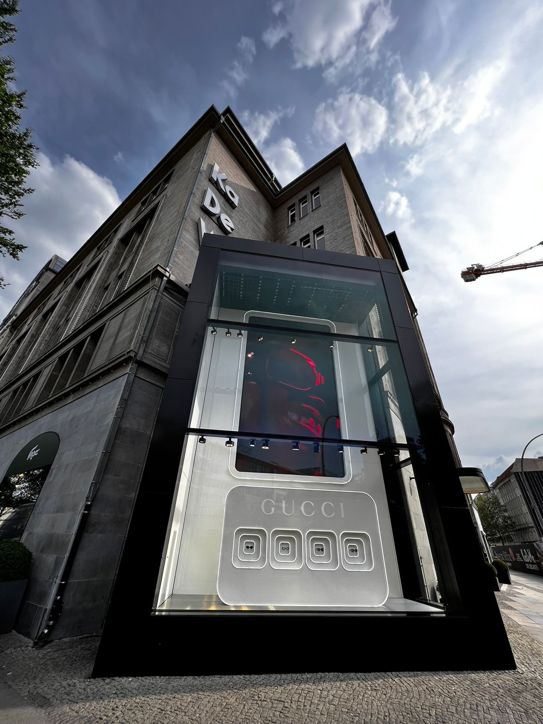
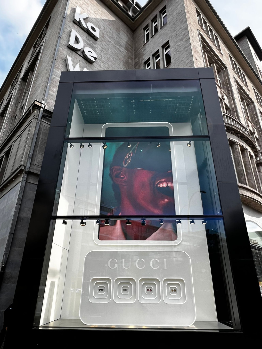
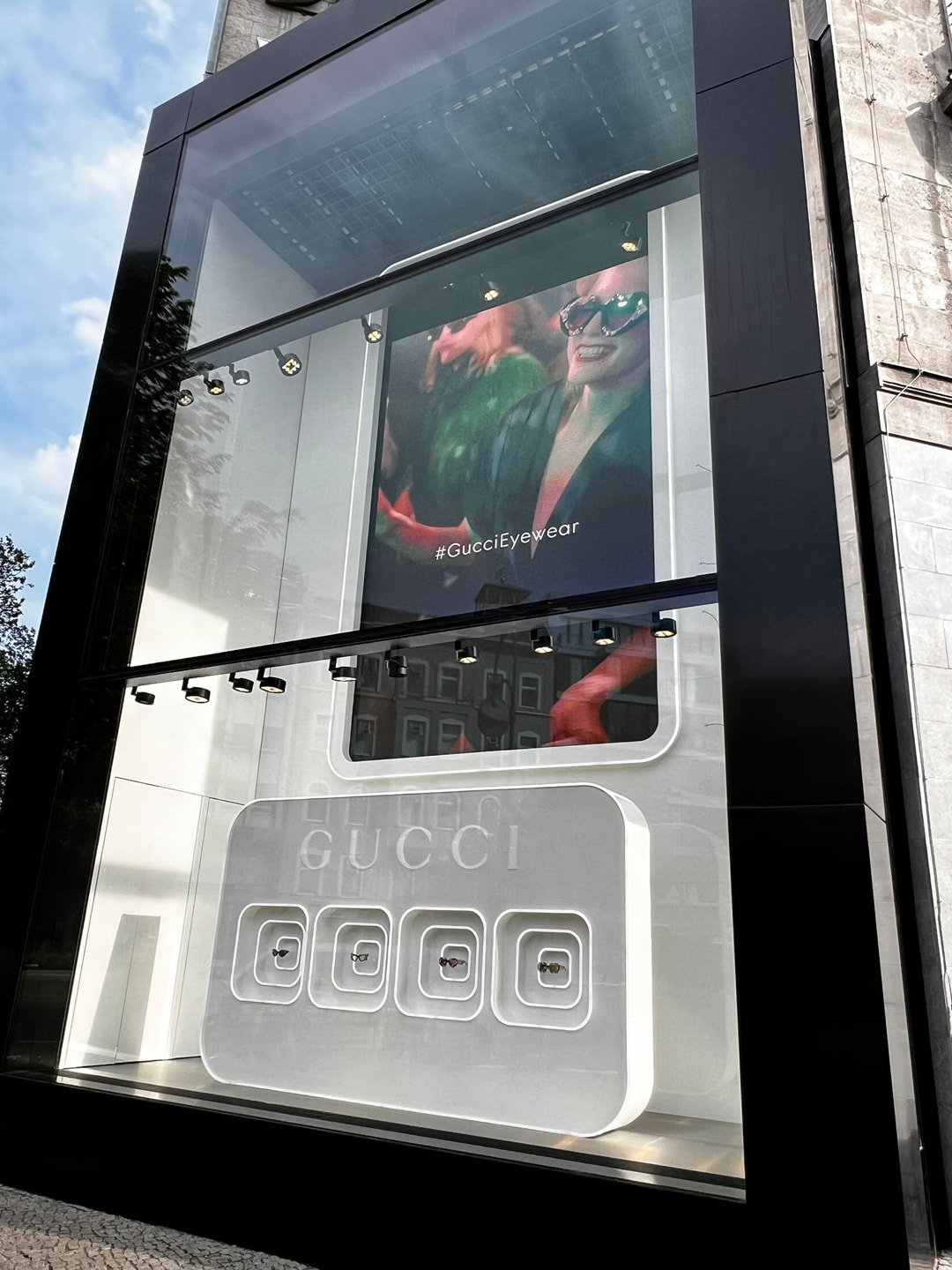
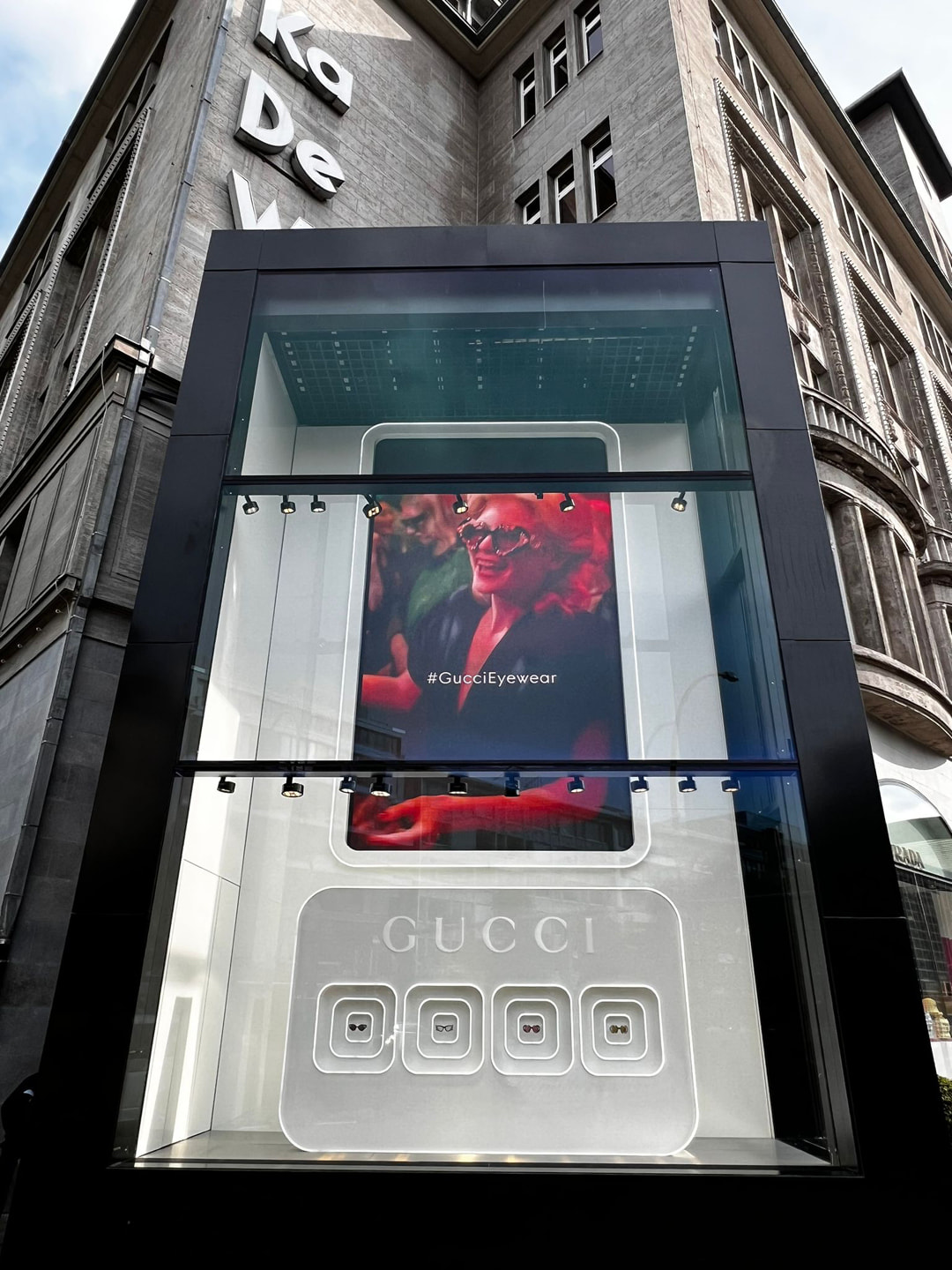
Gucci, Gucci, KaDeWe, yeah!
An alluring back(drop) for Gucci.
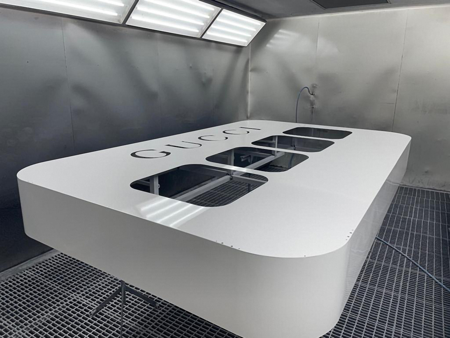
And once again it’s ‘Curtain up for #GucciEyewear’. This time, however, our client did not take us to the Moulin Rouge, but to the equally prestigious KaDeWe (transl. Department Store of the West) in Berlin.
When we received the request from Kering Eyewear in Milan to take over production and installation of the Gucci Hollywood Forever campaign for one of Berlin’s most coveted advertising spaces, we were, as so often, right there with a ‘ya-ya’. Even though the timing was laced up rather tight with 5 weeks from the request.
Artful staging, sophisticated materials, tantalising shapes and tight timings are precisely the temptations we just can’t say no to. We were not allowed to use black satin sheets, but the metallic materials and lacquers we used were just as noble and shimmered seductively at the onlookers.
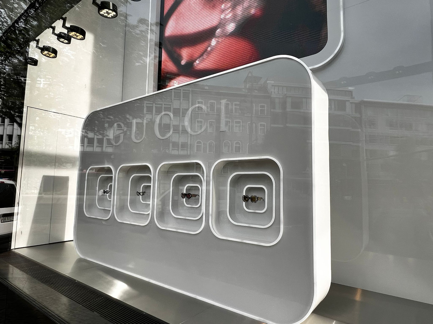
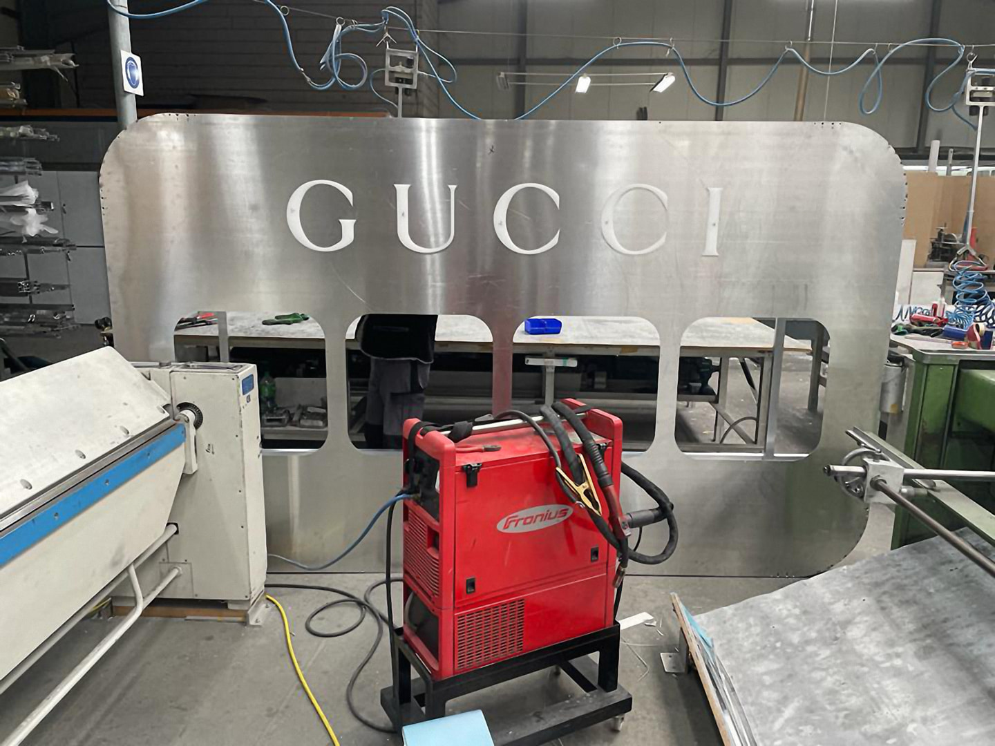
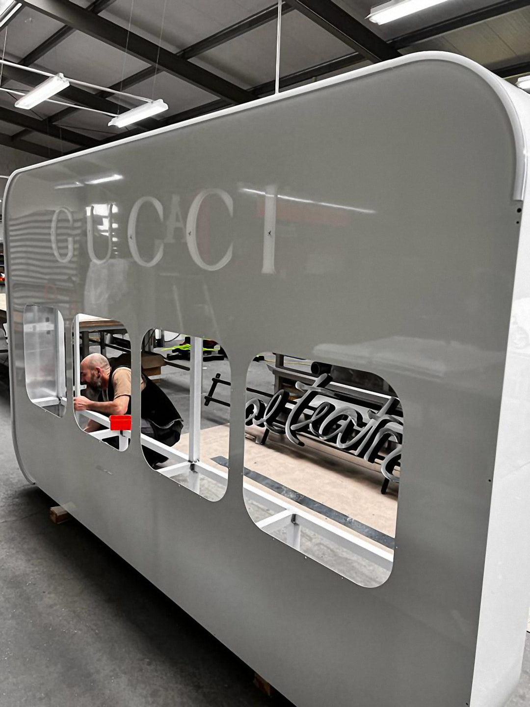
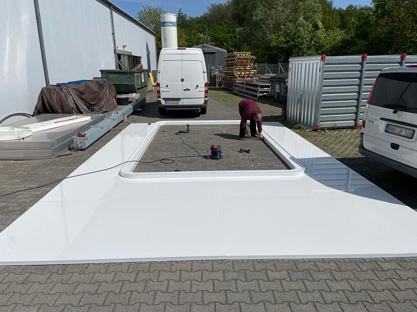
We gladly accepted the challenge of staging four rather small products on a stage of about 6 × 10 m and presented the ingenious sunglasses in an attention-grabbing special construction that attracted attention with silky shiny material, cleverly placed details and light accents.
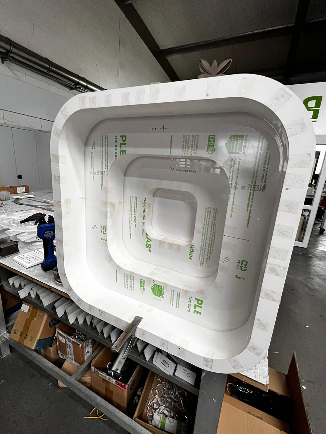
The LED wall, almost adorable at just under 3.5 × 8 m, was partially covered with a custom-made piece in accordance with the design specifications of the campaign. Set in scene by a luminous contour, the cut-out nevertheless allowed intimate insights into the campaign motifs and videos, which were specially cut to fit this area. In order to cope with the inevitable rising heat and to prevent embarrassing deformations (for us), we relied on aluminium for the construction of the back wall, which, thanks to a special high-gloss coating, achieved the acrylic glass look originally desired.
In the end we can say: customer, client and also we are still completely fascinated by the visit to Berlin’s most renowned department store. Thank you KaDeWe, we will gladly come again!
We are already looking forward to the next time when we are allowed to raise the curtain again for Gucci, Chloé, Balenciaga, Cartier, Saint Laurent, Montblanc or other top brands from Kering Eyewear.
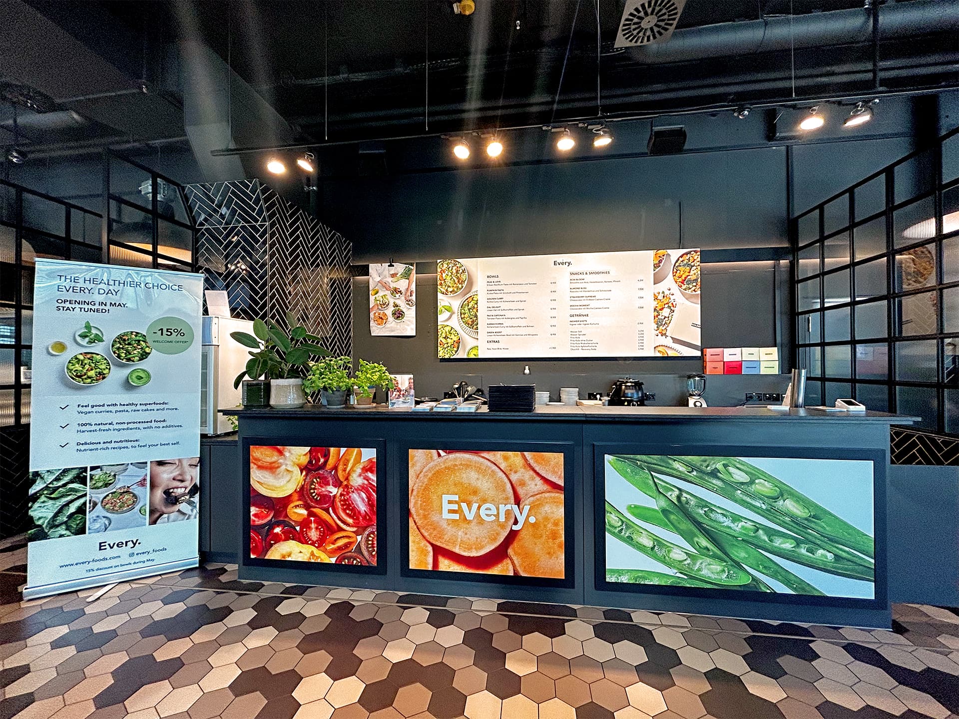
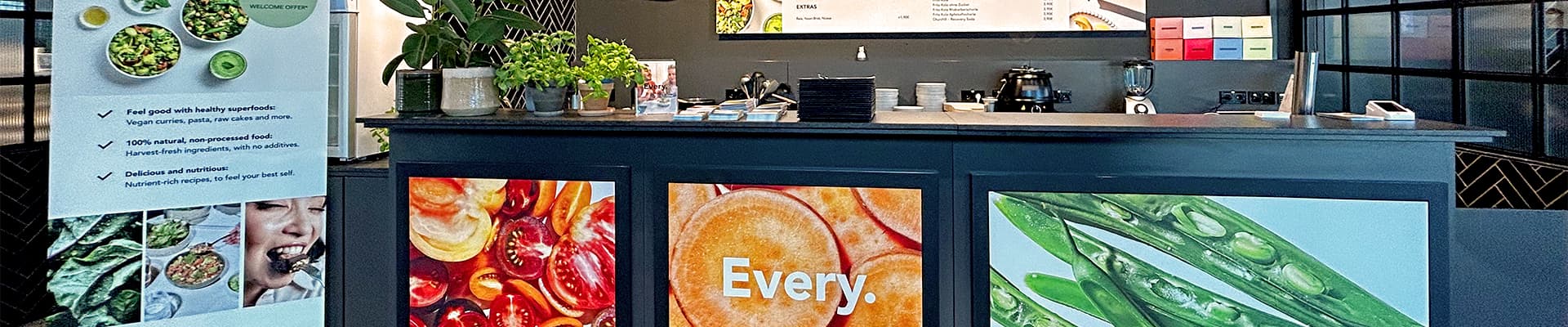
Vegan food at the Foodfactory Berlin. Thank you, Every.!
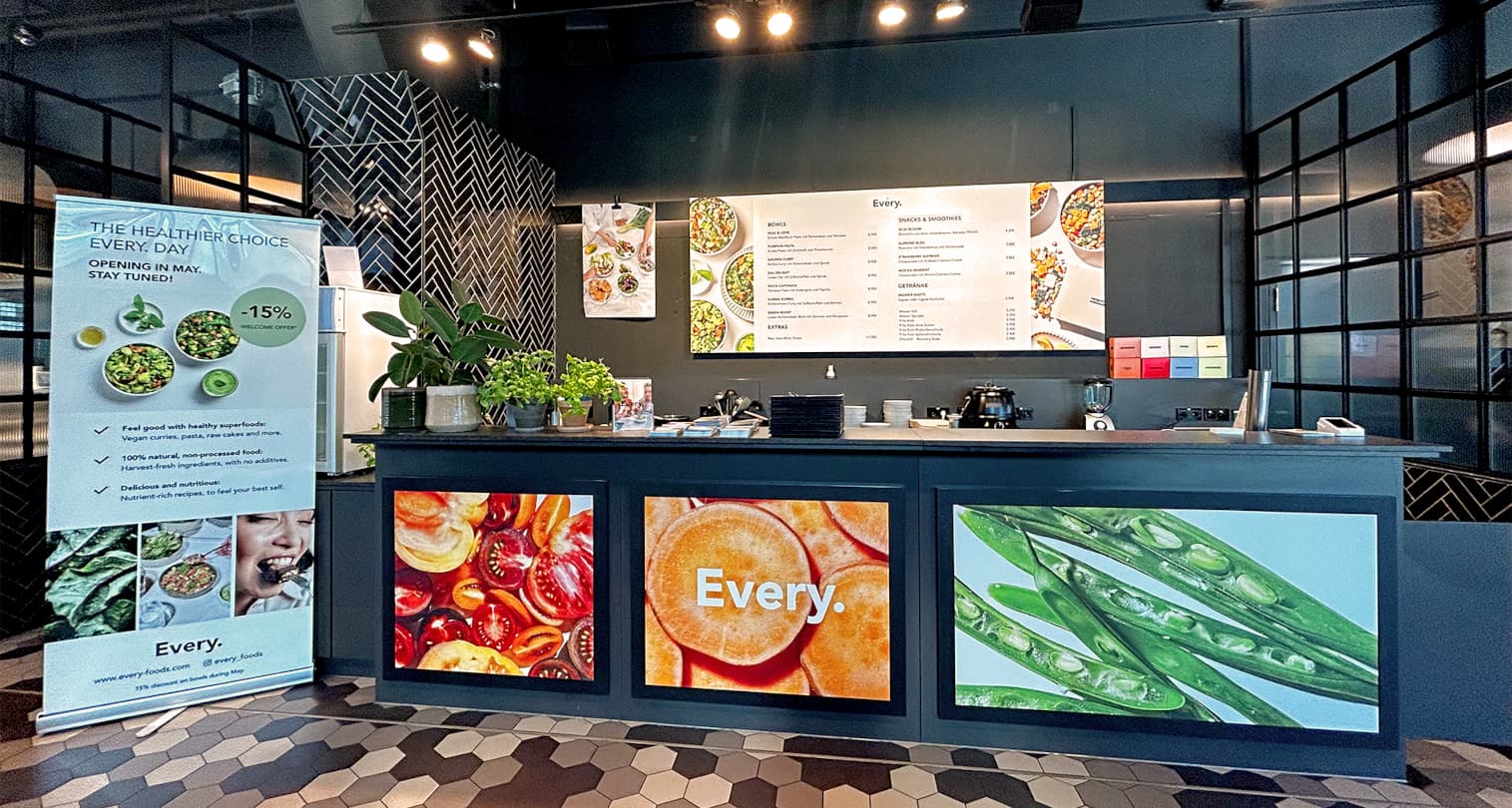
Every. has a pop-up store for two months in the Foodfactory in Berlin. They need an elegant solution for this, but one that is easy to remove or reuse.
We should pick out ideas on how to design the menu board on the wall and the three panels on the counter front. The menus on the board should be interchangeable. Timing of the concept including production and delivery was only two weeks. After several proposals, we decided on a printed Aludibond panel measuring 300 × 120 cm for the menu board. Each menu was printed on white Easy Dot foil, which is easy to apply and remove. Since the menu board could not be screwed to the wall, we had to find a solution for fastening it with hooks to the black metal bar.
The three motifs in front of the counter are also printed on Easy Dot foil and were stuck directly onto the black boards.
In addition to this work, a board for the opening ceremony and stickers also came from us; however, we did not take care of the roll-up to the left of the counter and the poster on the wall.
The client was satisfied: ‘Everything arrived perfectly, we set the menu board correctly and this is the amazing result!!’
BRAINARTIST awarded as an employer of the future!
Well equipped for the ‘war of talents’.
Here it is, our next award. But this time, for once, it’s all by and for us, and above all because of us. We are and have always been future-oriented. That’s what our logo stands for: always keeping an eye on the horizon to identify new trends, sustainable production techniques and innovative advertising channels at an early stage.
As of today, we can also officially call ourselves ‘Employers of the Future’. Awarded by the German Innovation Institute for Sustainability and Digitalisation and the German Entrepreneur Platform and under the patronage of Brigitte Zypries, former Federal Minister of Economics—a short fanfare at this point—we are proud that our efforts for more digitalisation, innovation and sustainability have also been noticed in our agency and found worthy of being honoured.
So we continue to look to the future and know that we are well positioned for it. Let’s go for new goals!
Hessian, authentic, exquisite!
The competition for the best village inns in Hesse.
We are proud to count the DEHOGA Hessen among our clients for several years now. This year, however, they had prepared a very special ‘Guudsje’ (Hess.: goodie) for us with the election of the ‘best village inns in Hesse’. The implementation from conception to design to realization was a real delicacy for us.
The competition, in which guesthouses, country inns and inns in rural areas of Hesse are allowed to participate, honours enterprises that, in addition to all the unique qualities that make up good gastronomy, also take on an important social function in their environment. They symbolise social togetherness, conviviality, club life and the liveliness of the local community and are regarded as places that hold villages, small towns and communities together and make them a piece of home worth living in for everyone.
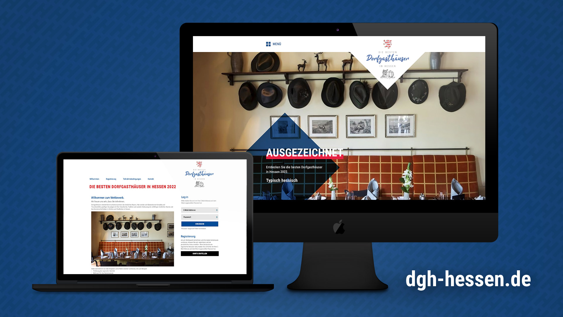
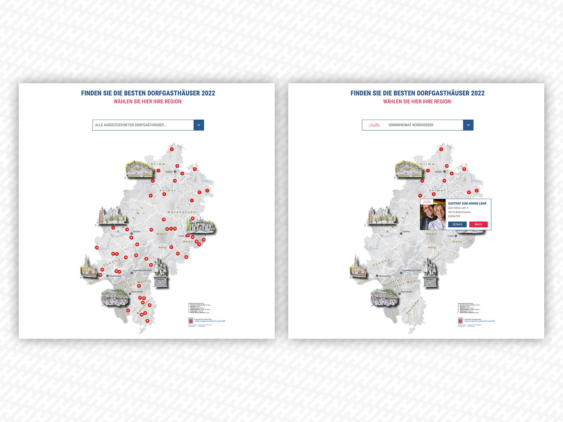
In order to tame and structure the incoming flood of applications, which had been estimated by the past competition, the #dehogahessen turned to us with confidence. Starting with only a questionnaire in Word format and the brochure of the last competition as a design template, we set to work and developed an application platform that offered participants the opportunity to submit their application including photos, videos, proofs and certificates in all file formats online—instead of by postal mail. Structuring the application catalogue with the help of filter questions made it easier for the participants to fill in the various questions about their company, missing information and documents were immediately visible and did not have to be requested and sent again. The integrated evaluation system saved our client hours of tedious manual evaluation and stacks of folders and immediately sorted out insufficient and incomplete submissions. In further steps, it enabled each member of the jury to evaluate only the most promising submissions directly in the system, independent of location and time, and to award the winners.
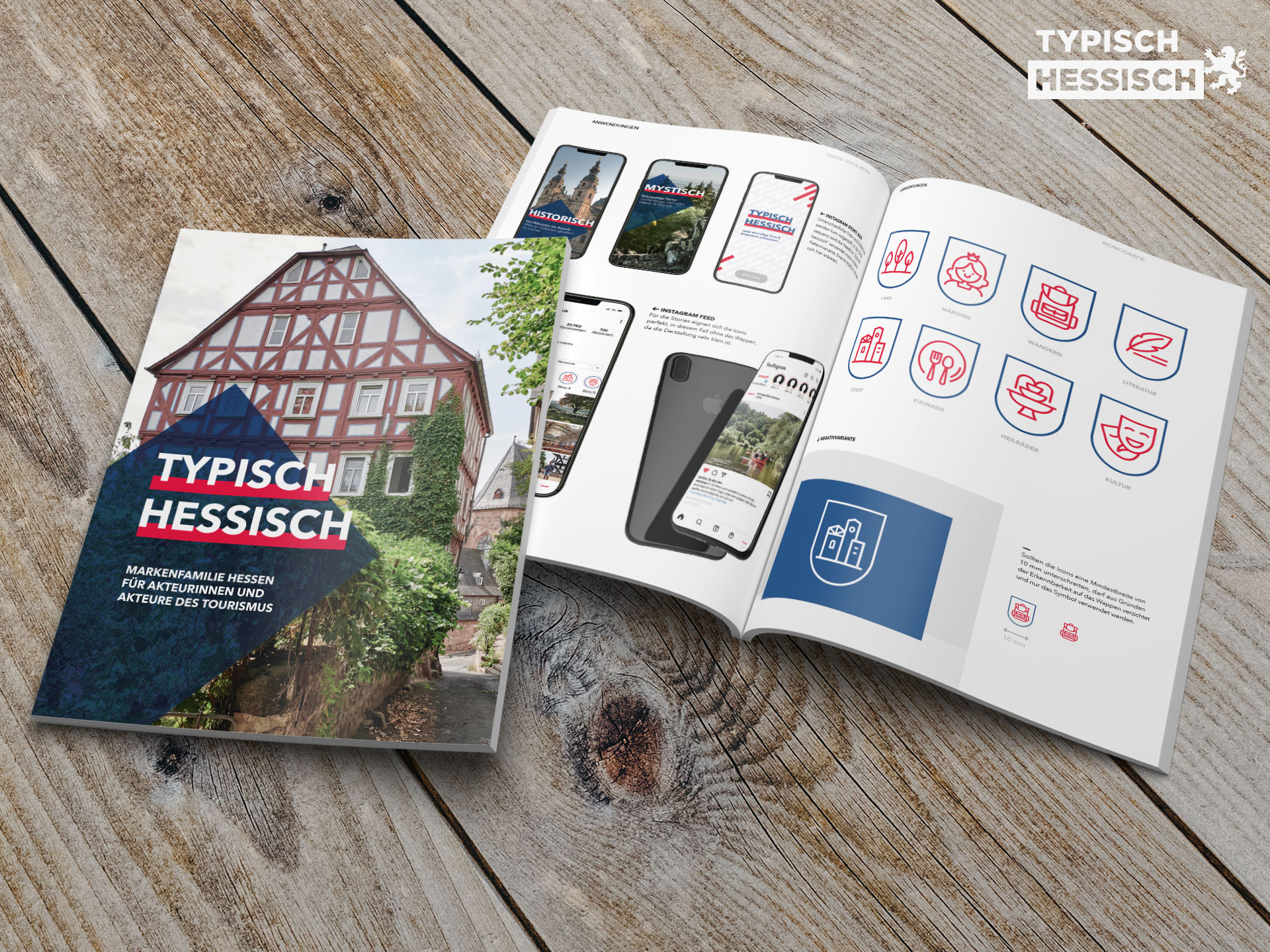
Of course, we also put the winners in the spotlight. In a ‘typisch hessisch’ style (transl.: ‘typical Hessian’—Hesse brand family guidelines for the tourism industry), we conceived and designed a digital guide (https://dgh-hessen.de) in which the winners are presented and, thanks to an interactive map including a route planner, are much easier for interested guests to find than in the printed brochure.
We would also like to congratulate all the winners of the competition at this point. Continue to be the place for history and stories, for people and personalities, for innovation and tradition, new and old and continue to inspire with your unique concepts.

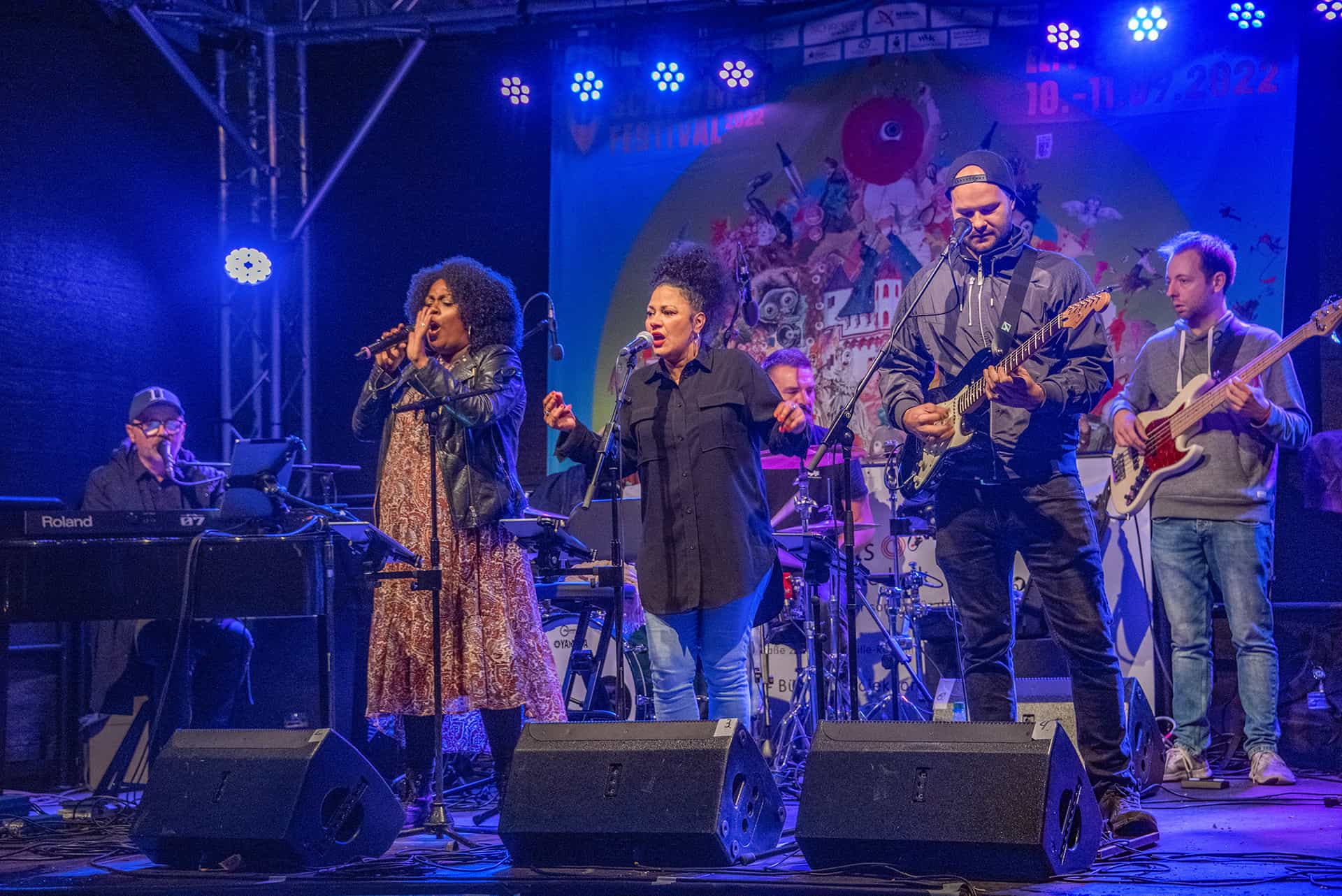
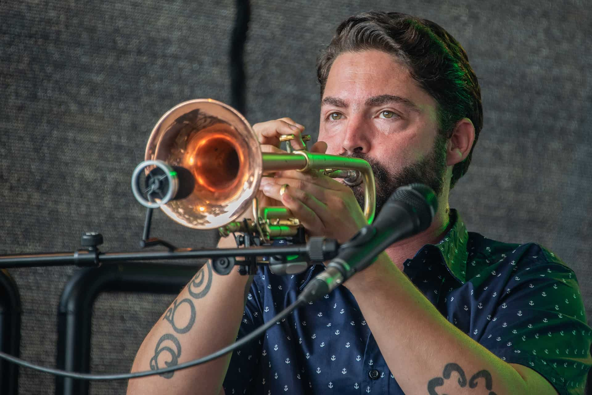
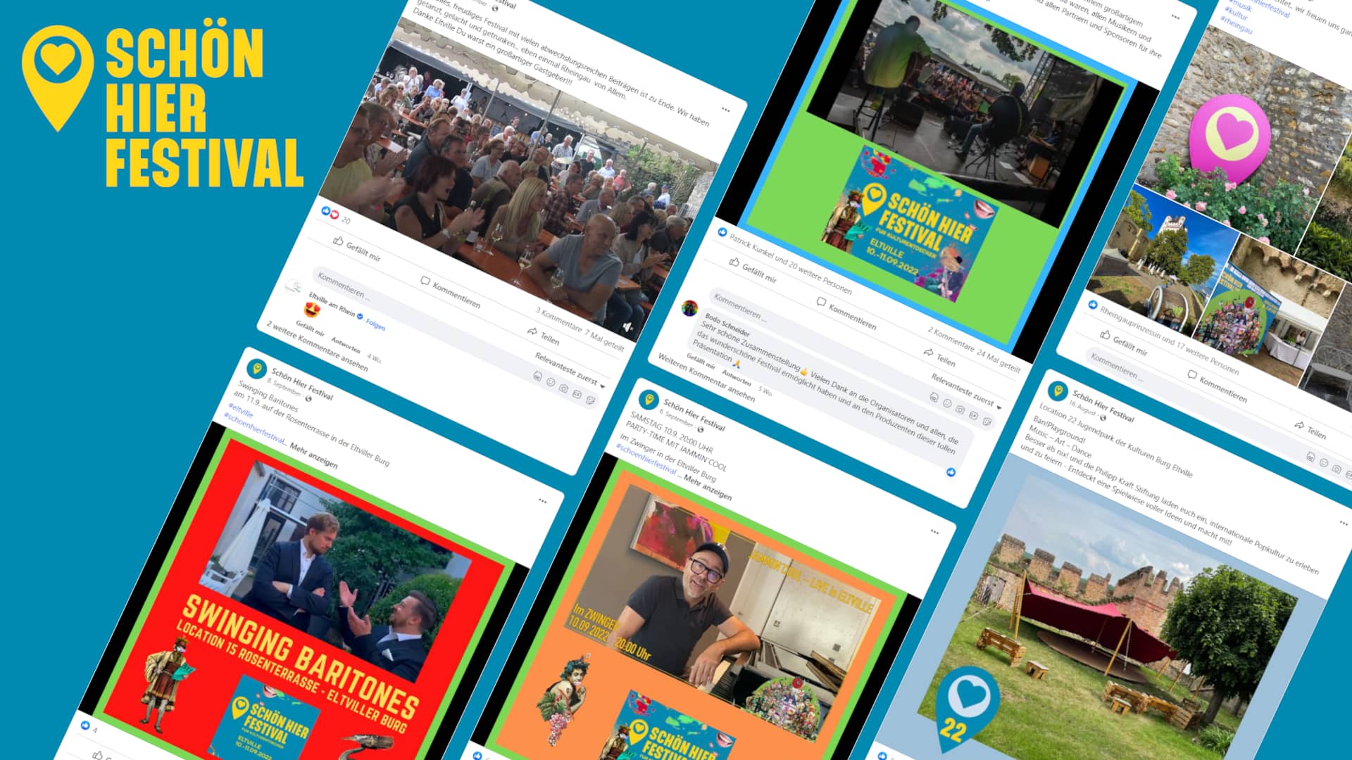
A bit of everything, please! For cultural explorers
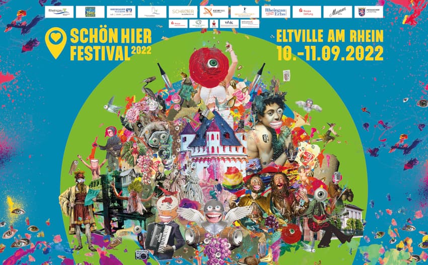
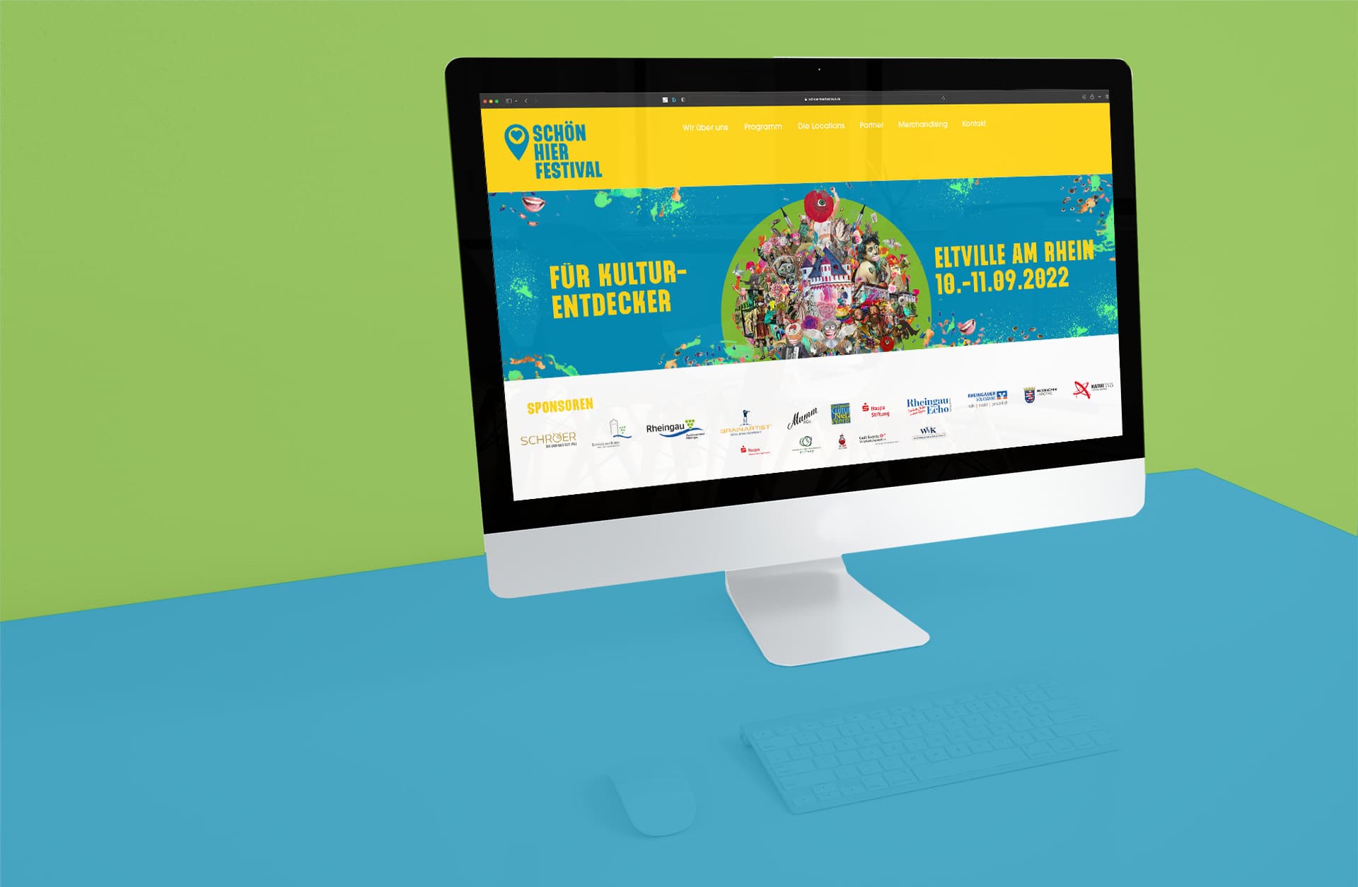
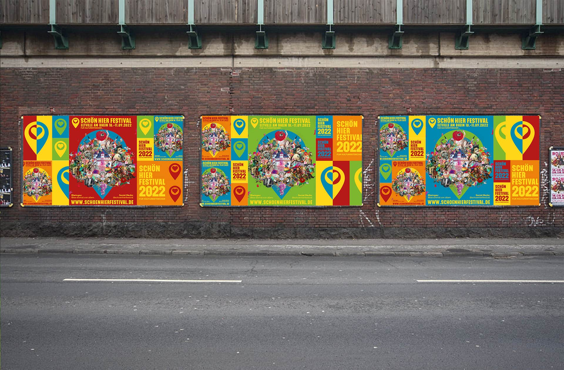
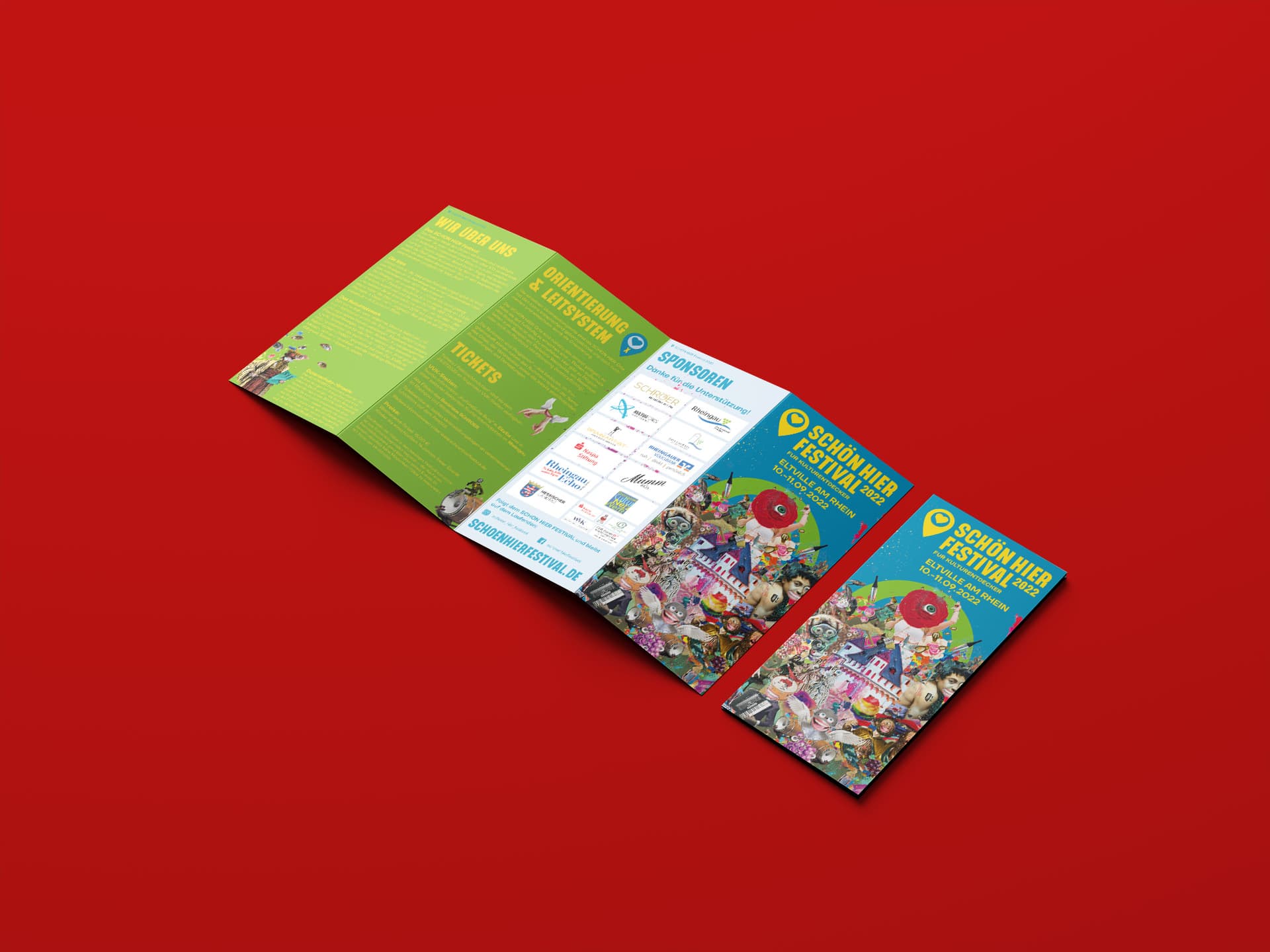
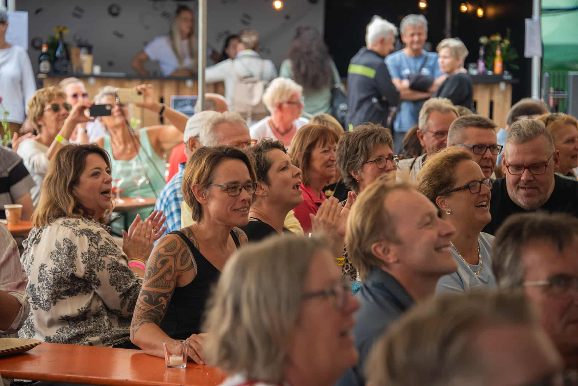
‘SCHÖN HIER’ festival 2022 in Eltville, Germany
In 2022, after a 2-year break from Corona, we finally contributed again to making the Rheingau region a nicer, in German ‘schöner’, place to be and linger.
The ‘SCHÖN HIER’ festival is a two-day cultural event at which over 200 artists from the genres of music as well as performing and visual arts of the Rheingau’s cultural network present their passion in diverse locations. According to the motto ‘It’s served … a bit of everything, please!’, festival guests can explore the cultural diversity of the region and, along the way, feast at numerous stalls and taste Rheingau wines. A real treat for young and old.
This year, the logo, key visual and design of the communication media for the ‘SCHÖN HIER’ festival were once again created by us. Each year, the key visual is tailored to the host location and contains some of its characteristics that want to be discovered. In addition to the well-known Electoral Castle, St. Peter and Paul, Johannes Gutenberg, the Biedermeier Association, the Witches of Erbach (a popular carnival club) and even the ‘Martinsthaler Wildsau’ (the ‘Martinsthal Boar’, originally the name of a vineyard site in the suburb of Martinsthal) are among the characters for #Eltville. As Eltville ist awarded an official #Rosenstadt (city of roses), roses adorn the collage, which is arranged like a bound bouquet of flowers as a tribute.
In addition to classic flyers and programme folders, we also took on the production of banners, backdrop / press walls, posters, beach flags and signs to identify the individual venues from afar. Later, deep into the planning, we were also able to support the organisers below-the-line with countless pictures of the musicians, artists and locations, in-house produced videos, graphics and collages, and with the support of the social media channels and website.
Again, we think it was really ‘schön’ and are already looking forward to next year’s #schönhierfestival.


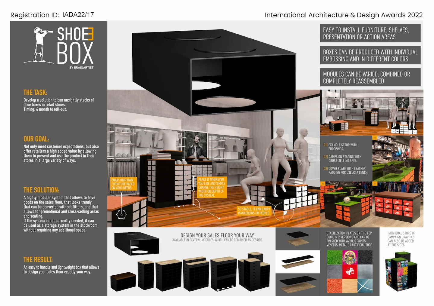
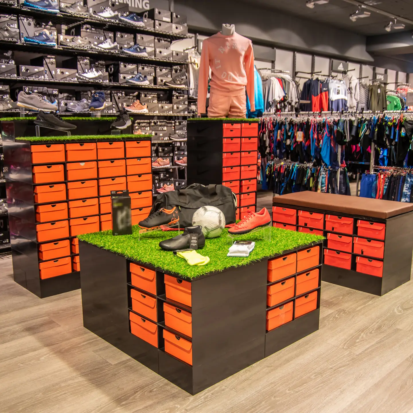
‘Architecture & Design Award’ for our ShoeBox.
POS interior without ShoeBox? Almost unthinkable!
The ‘Architecture & Design Community’ was founded in 2019; the birth year of our ShoeBox. Year after year, it ensures that architects, designers and engineers from all over the world, among others, get attention with their projects in numerous architecture, interior design and landscape categories.
After our modular POS system won an ICONIC AWARD 2021 for ‘Innovative Interior’, this year it received the International Architecture & Design Award 2022 for ‘Retail Interior’!
Two interior awards? That’s right. Our ShoeBox is a true POS interior genius when it comes to having a system for sales floors that puts merchandise on the area, looks trendy, can be remodeled at any time without fitters and allows for promotional areas and seating.
Our new passion for collecting.
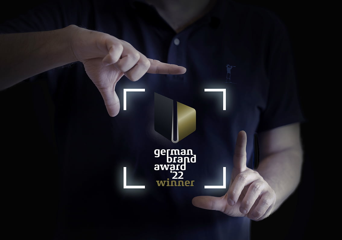
The fourth German Brand Award in a row for BRAINARTIST.
We have it! Nominated in October ’21, awarded on 9 June and just arrived: the German Brand Award 2022 for ‘Excellence Brand Strategy and Creative Brand Strategy’ in the B2C sector for our client sportgreen. Now we are green with pride; after all, this is our fourth German Brand Award in a row. But we can’t just bask in the glow of success and sit back and relax. We’d better keep up the good work. We promise!